ProjectMedusa
Where science and beauty meet her unmet needs
A product designed to de-stigmatise and raise awareness for menopausal women while creating a brand that doesn’t treat their stage of life like a condition
MY ROLE
Product Designer, Graphic Designer
User Research l Persona Development l Concept Development l Usability Testing l Information Architecture l Usability & Accessibility
CREATED BY
Alexandra Camp
TOOLS
Adobe Creative Suite, Figma, Figjam, Otter
THE CHALLENGE
To create an effective experience to help de-stigmatise and revitalise menopause by finding a balance between pharmaceuticals and ‘wellness’, which can often be misleading in terms of benefits to the user.
THE BACKGROUND
This project was inspired by watching my mother, silently coping with the effects of menopause. I felt the current products were underwhelmingly branded and contributed to a general feeling that menopause was perceived as an unspoken illness.
INITIAL RESEARCH
What did I find?
Conducted desk research and a small focus group with a small collection of menopausal women (they are my user testers throughout). This exercise was designed to let them voice their concerns and wants in menopausal products and experiences.
Menopause vs Skincare Products
What are the real needs?
The importance to understand what is currently on the market drove me to go on a hunt around Dundee’s drug stores. My observational trip was a great opportunity to generate and formulate questions for my project. Most products were not appealing however some were better than others. Opening a positive conversation for my user testers.
Key Insights & Differences:
Menopause Products:
Cluttered design
One use packaging
Too medical looking
Unattractive branding
Over use of pink (overly feminine)
Skincare Products:
Focus on “confidence’
Wellness is key
Thought through branding
“Feeling your best”
Empowerment
With many menopause products being applied to the body in the same way, shouldn’t they also be branded to let menopausal women feel empowered and their best self?
After conducting user interviews which included talking about women’s personal experiences with menopause and what they look for in products, the idea began to define:
Moving away from pharmaceuticals and focus on natural remedies to help with symptoms instead of the HRT.
The Archetypes
After conducting research and validating my insights, I created three archetypes to see how to begin defining the project path.
ITERATIONS
Defining Through Making
I began with rapid prototyping using found materials to start on a variety of concepts, from this I did a handful of usability testing and have gained valuable feedback.
ON THE GO KIT
THE CARE PACKAGE / BOX DESIGN
On the go kits: Prototyped above is a ‘Travel Kit’, often women in business travel all the time. So a personalised smaller package could be more useful. All the products you find within this would be under 100ml which could then be brought through airport security with no issues.
Care package: The idea of this product is to be a care package for those who are starting to experience menopause. All the products found in this box will focus on a common symptom women often experience. For example, hot flushes or insomnia.
INITIAL BRANDING MOCKUP
Storytelling is key for engagement
Evalutions:
Product versatility
Creating a well rounded service
Refining
Beginners kit idea generation was done by creating Photoshop mock-ups in order to properly visualise the concept and reach out to fabrication companies.
The approach was used to define a colour palette that would best fit with the desired outcome. Do we want something upmarket, sleek and luxurious or playful, crafty and fun.
After reaching out to Downie Alison Downie, a bespoke box and book making company in Glasgow, I found the fabrication was disadvantageously expensive so I decided to rework box shape. The move to a simpler box with two components is complimentary for ease of manufacture.
Construction

Box shell net is cut from single core cardboard on a laser cutter for precise measurements

Net is then bent soon after to prevent stiffening of material

Corrugated paper is used to create glue tabs as its very absorbent

Uniform rectangles are cut for both the inside and out of each box components

Each square is the almost the size as the box width to maximise the pressure distribution

Before gluing, the shell is taped shut with masking tape to keep is steady for applying the glue
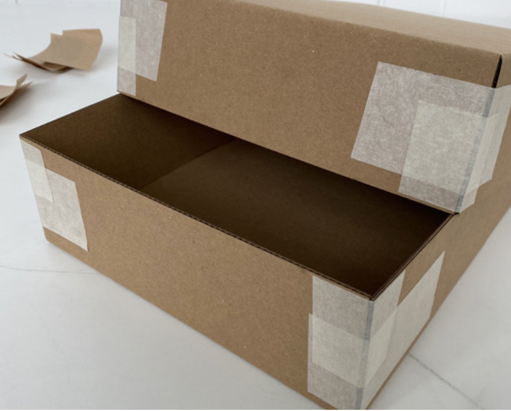
After both components are taped, a test fit is done to correct any adjustments
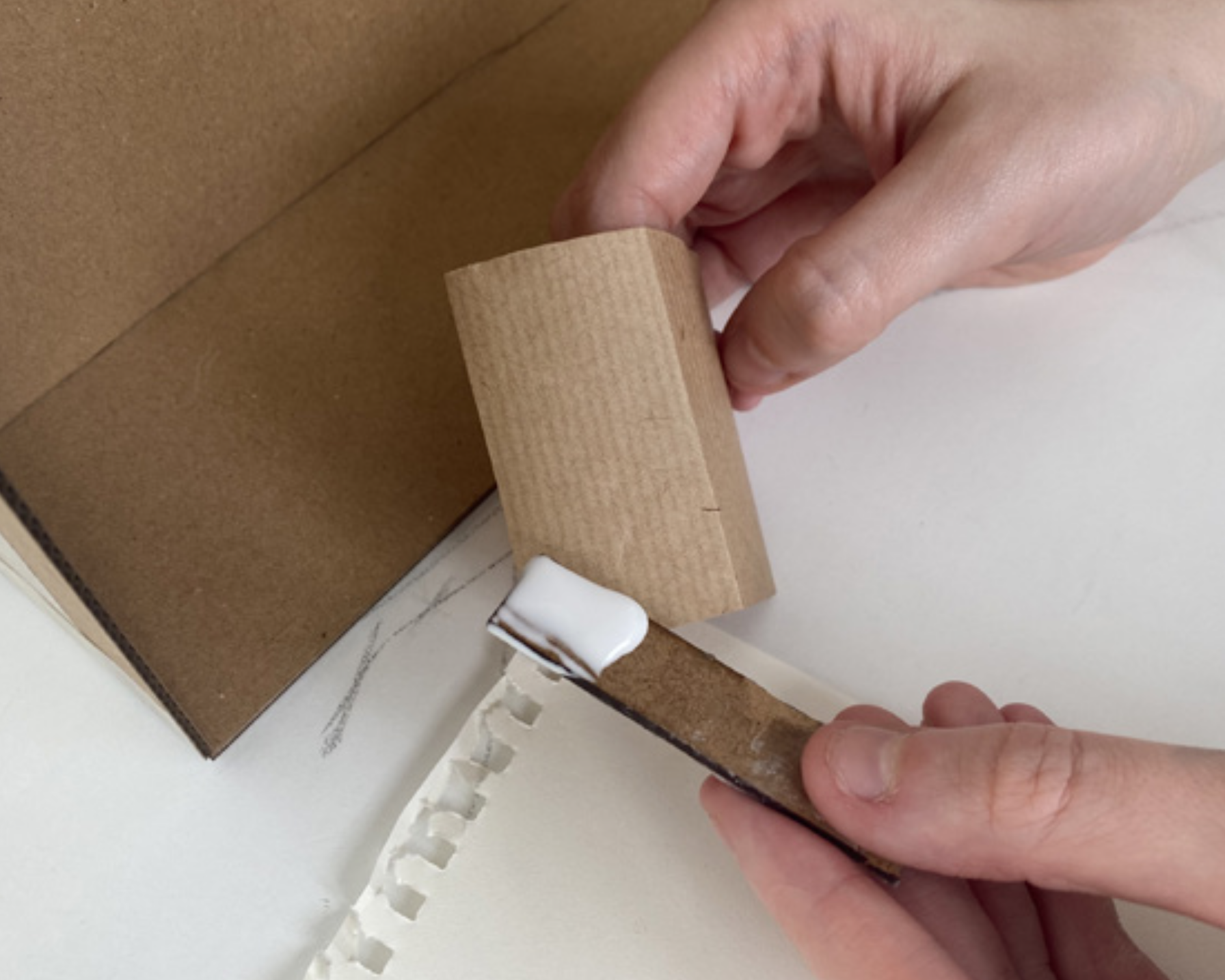
Using an off-cut of material, glue is applied to one side of the paper to stick together an inner corner

A ruler was used to smooth down the paper and press it right into the corner

Before adding a the wrapping a final test fit was done to ensure the halves opened smoothly
Creating a strong brand
ProjectMedusa’s Symbol
From the start Medusa was always going to be the symbol for my logo, I needed to find the right balance to create something powerful and empowering without being unsettling and off putting.
Throughout the iterations I continually sent images to my user testers to get their feedback for development
Product labels
Taking inspiration from brands like Jo Malone, I created a range of labels that would be used for each of the product present in the kit. After sending out a poll a favourite design was chosen to move forward with, below is only a couple of the designs sent out.
LABEL ITERATION #1
LABEL ITERATION #2
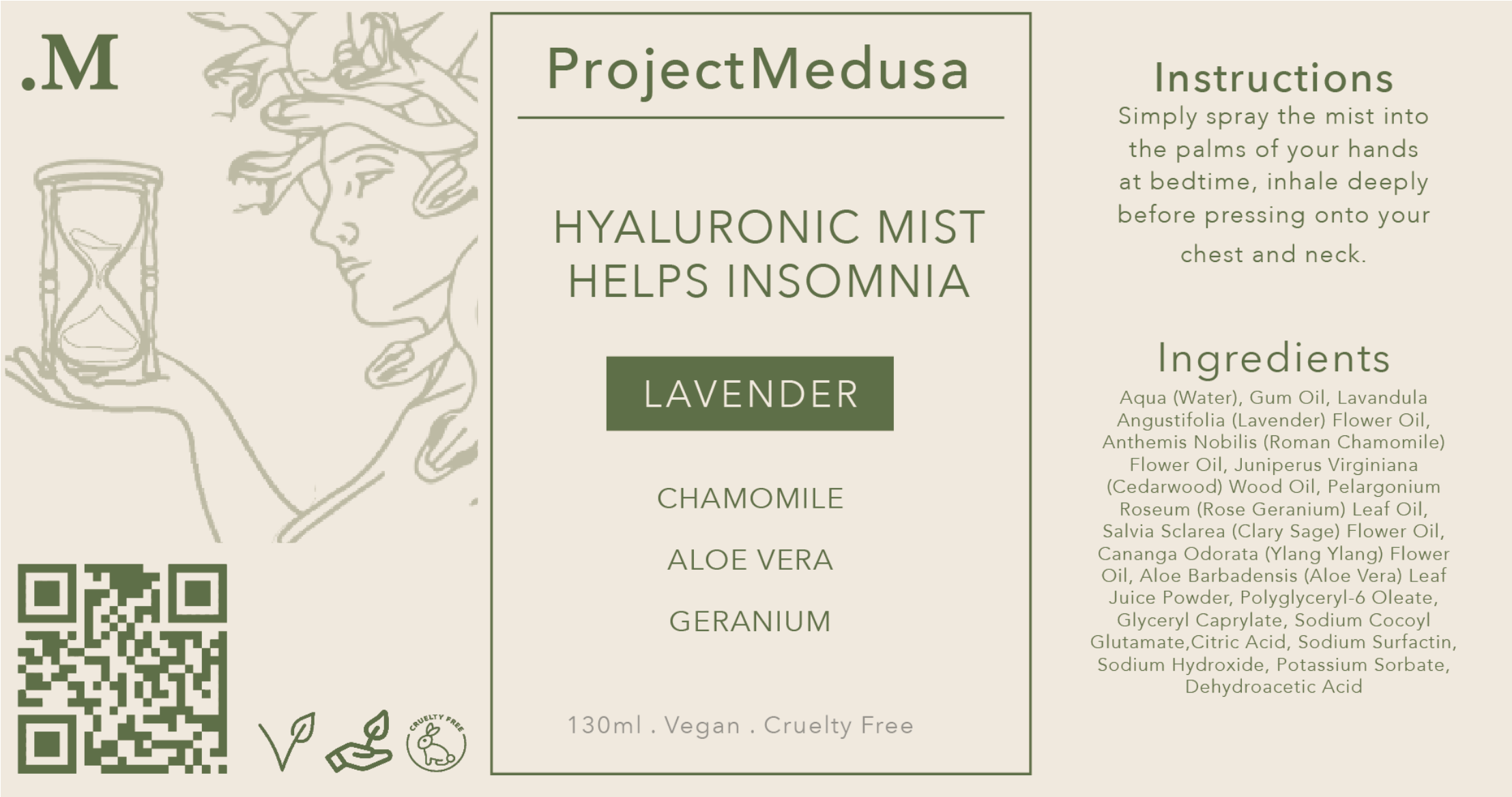
Talking to my sample group and making the required refinements led me to create the final label design below, this is adjusted to fit the different shapes and sizes of bottle and tubs.
FINAL LABEL DESIGN
The brand
One of the main complaints encountered from my focus group and own user testing was menopause products being “too medical” and “too feminine”. To combat this, I decided to choose a more neutral colour palette. Green is typically used to capture ‘nature’ and ProjectMedusa’s focus is on natural alternatives to help menopause.
SOLUTIONS
Expanding the service
To create an effective service, I designed a website taking inspiration from existing luxury and skincare brands. The website used a lot of lighter colours to elevate and lift the atmosphere of the brand. This also provided a contrast to the darker colours used in the physical products.
I created a fully functional basic website prototype to showcase what a ProjectMedusa platform could be:
*Optimized for laptops but will run on mobile
WEBSITE HOMEPAGE
ProjectMedusa
A product service designed to de-stigmatise and raise awareness for menopausal women while creating a brand that doesn’t treat their stage of life like a condition
Composed of a small collection of glass bottle products, each focusing on aiding a common symptom of menopause through natural means and consistent branding.
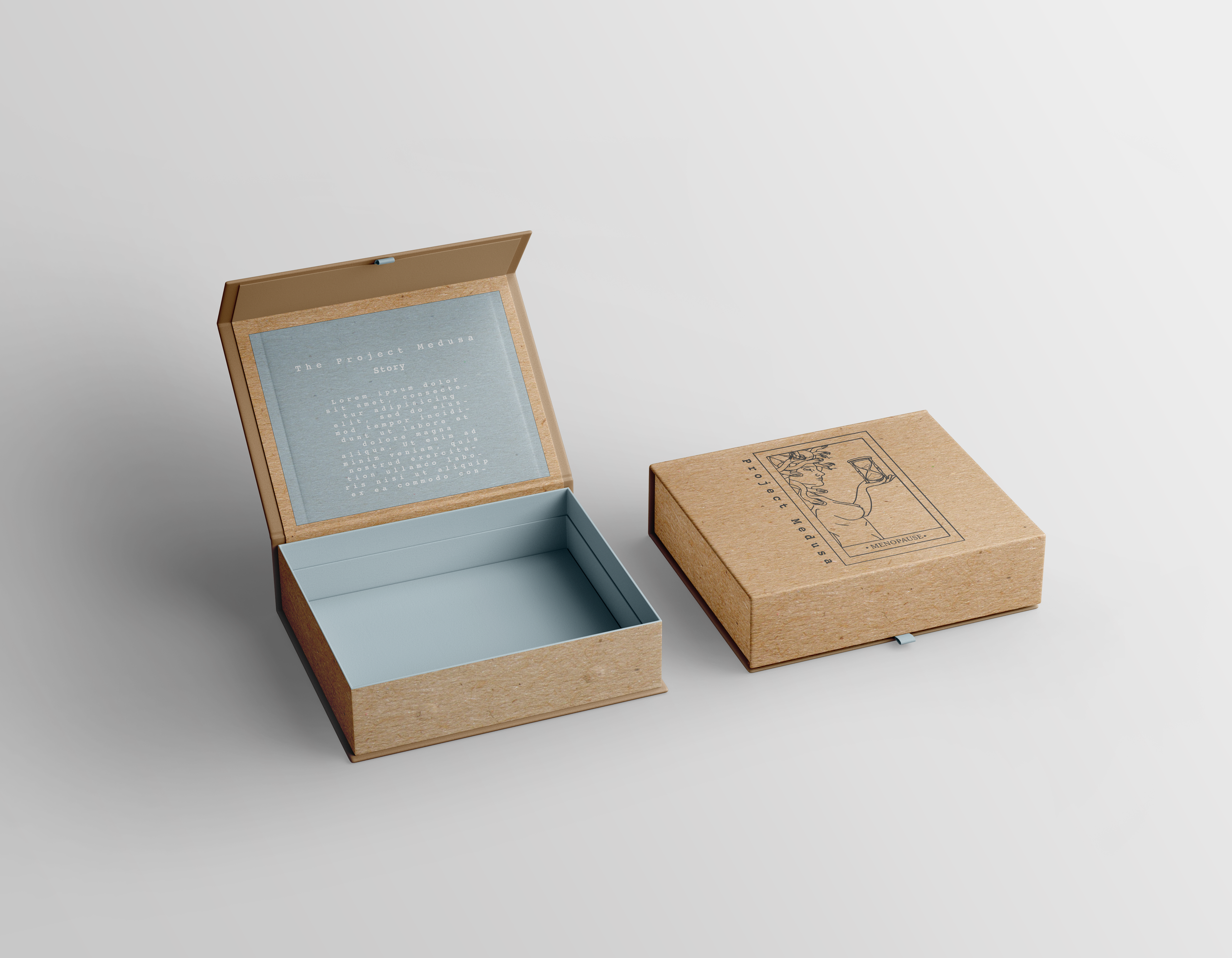
The hand crafted box design was created akin to the likes of Apple product packaging. With the tight, uniform fit and slow reveal build anticipation about the products inside.
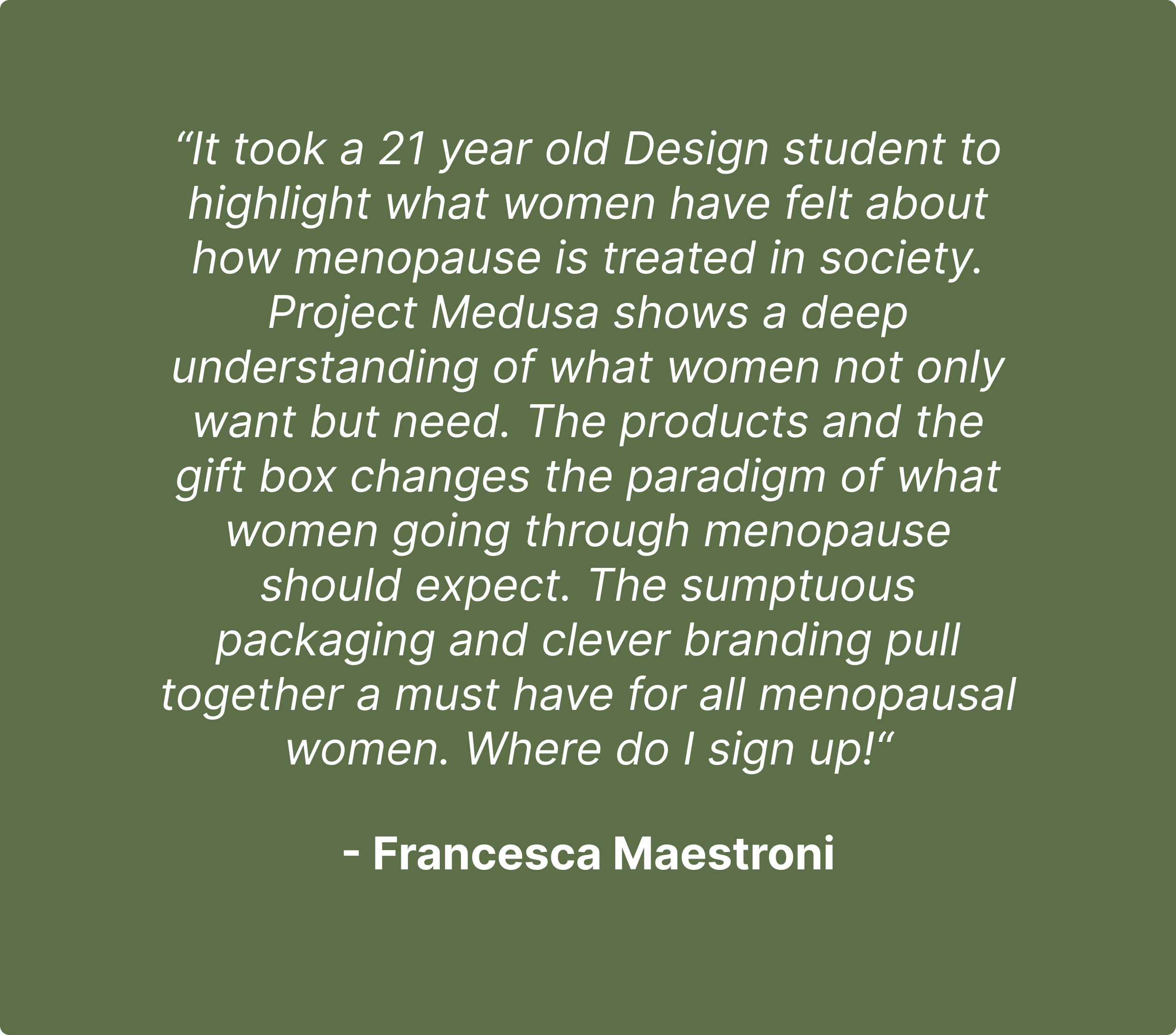
User Feedback
REFLECTION
Curating ProjectMedusa has been an interesting journey. It started out as a simple idea to help my mum and turned into a fully branded service. Although there were many challenges, the appreciation I have received from focusing on such a topic has been extremely rewarding.
I am very happy with how the final construction of many aspects of my project turned out. Since I had no prior experience with web design or sewing, it was very surreal to see fully realised and physical models.
Looking back, I do feel there could’ve been more development into expanding the service, with a focus on creating a few physical bundle sets. So much of my time went to creating and building the one gift box which already took a great deal of time to successfully accomplish.
I do believe ProjectMedusa is a very focused and well rounded project that does exactly what I set out to achieve.


