MedSafeDiet
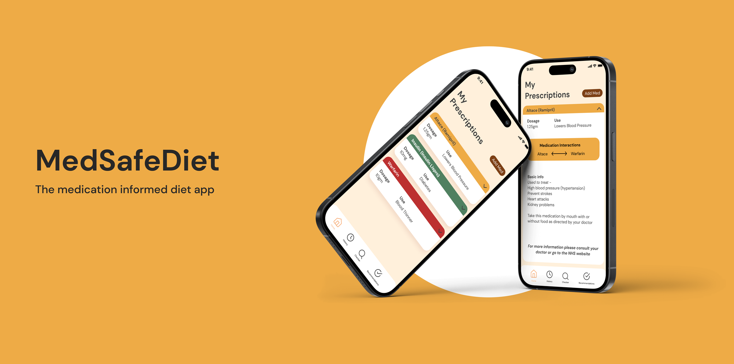
A personalised medicine-informed, prescription and nutrition app which aims to empower individuals by offering a comprehensive detection and educational service to enhance personal well-being and healthcare outcomes.
CLIENT
MedSafeDiet - Oliver Britten
MY ROLE
UX & UI Designer, Designer Researcher
TEAM
Alexandra Camp, Julia Breire, Michael Palfreeman, Morgan Ager, Tamara Zipporah
TOOLS
Figma, Figjam, Otter
INTRODUCTION
THE CHALLENGE
BACKGROUND
Learning about the product
My team and I had the opportunity to contribute on MedSafeDiet, an innovative medication, diet and supplement monitoring app. Our goal was clear: to empower individuals by offering a comprehensive detection and educational service to enhance personal well-being and healthcare outcomes.
Our challenge was to develop a digital platform that aims to bring together medically informed prescription and nutrition information through educational services.
We met with Oliver, the visionary behind MedSafeDiet, to discuss and learn about his expectations and the direction for the project.
From our conversation we gained four main design focus insights:
Personalised nutrition, how important it is and how underutilised it is.
Wants users to feel empowered to be proactive about their own health and be their own health advocates.
Predominant issue Oliver wants to target is medication interactions.
User friendly at the focus.
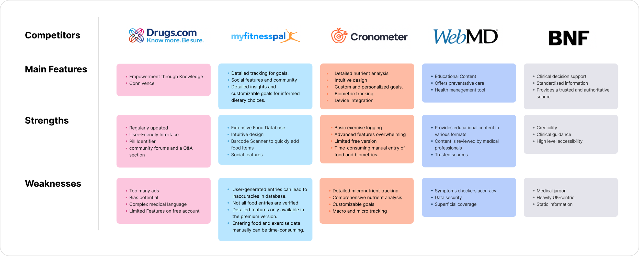
COMPETITOR ANALYSIS
Who is out there?
After our discussion with the founder we went and looked into competitors that he identified. WebMD + Drugs.com overwhelming user experience, not easy to digest information, big listed results with hundreds of possible interactions and severity levels. BNF is essentially designed and used by clinicians. MyFitnessPal and Cronometer are very nutrition focused with granular daily tracking.
RESEARCH
What did we find out?
“The most challenging part is to figure out what supplements work for my prescriptions.”
- Interviewee, April 2024
After looking into the market scene, conducting general research provided us with a deeper understanding of the medication and prescriptions landscape, we also wanted to find out people’s prescription and management habits. To do this, we used quantitative and qualitative methodologies, we organised 20 1-1 interviews and sent out a short survey from which we received 50+ data points.
Take over the counter medication and supplements, indicating the risk for unknown interactions.
take three or more different medications
Are using digital platforms and services to manage health.
Our Archetypes
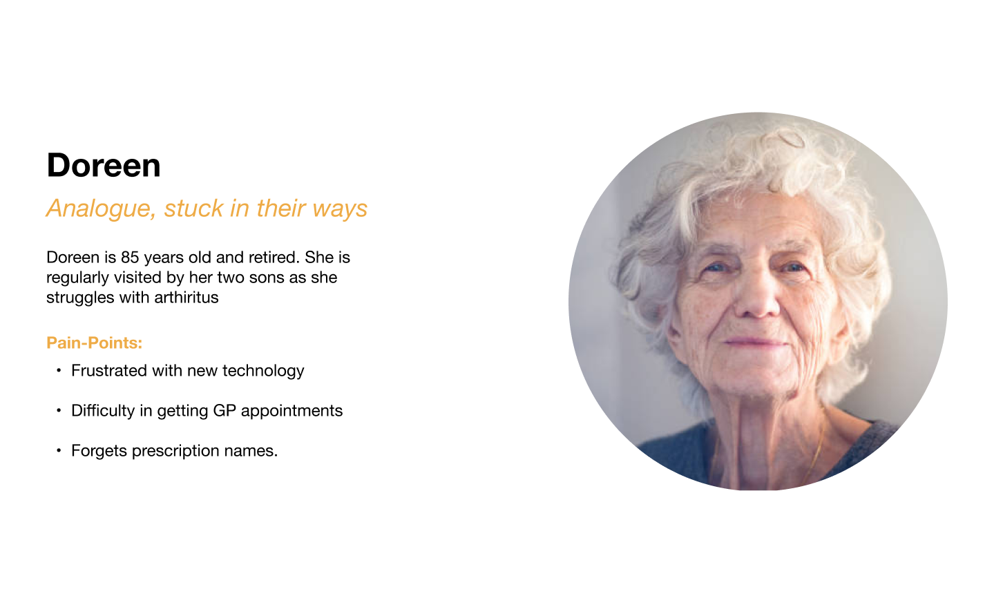
After conducting our research and validating our insights from our discussion with Oliver we discovered, we created three archetypes from our research to see which path we user we would be able to best design for in the time frame of the project.
User Challenges
01:
Frustrations with technology lacking simplicity
04:
02:
Digital and analogue methods used to keep track of medications
Access to medical professionals is too long
05:
03:
Majority are conscious that diet affects medication
Most people only share medical information with doctors
This was an important point in the project as we continued working as a team throughout the research but from here we began to focus on our individual solutions. This started by us choosing a persona to design for
THE PROBLEM
What are we trying to solve?
We created user stories to help guide us through this ideation phase, I felt designing for the Analogue, but open to digital solutions archetype was the most rewarding to focus on:
User Story 1 -
As an analogue user, I would like to have information provided in a clear and organized way so that I’m not overwhelmed with information.
User Story 2 -
As an analogue user, I would like to not be put off and bombarded with advertisements, sign-ups and other prompts when trying to access my medical information
Below are the key areas I needed to focus on in order to understand and effectively develop a successful solution and app, while addressing the design challenge.
PROBLEM STATEMENT #1
Analogue users often get put off by digital platforms due to information overload when signing up/starting new apps
PROBLEM STATEMENT #2
Analogue users often get overwhelmed and lost while navigating an app because of complex features
THE APPROACH
Designing with simplicity
STEP BY STEP OF A USER OPENING THEIR APP FOR THE FIRST TIME AND THE EASY ONBOARDING PROCESS WITHOUT OVERWHELMED INFORMATION
A MEDSAFEDIET USER ACTIVELY USING THEIR APP WHILE IN PUBLIC TO SCAN, CHECK AND IDENTIFY POTENTIAL INTERACTIONS BETWEEN THEIR MEDICATION AND THE ITEMS THEY WANT TO BUY
I built different user flows to see how I would structure the app and its basic functionalities, taking into consideration all the research and insights we have found and try to make things work better for the user.
ITERATION
Low fidelity wireframes - testing usability
I began rapid wire-framing in low-fidelity to be able to visualise the start of the app, from this I did a handful of usability testing and have gained valuable feedback.
Include a manual input option as well as a scanner
LOW FIDELITY PROTOTYPE SCREENS DEPICTING SIMPLE ONBOARDING AND VARIOUS FEATURES
User feedback and suggestions:
Implement more engaging language to entice users
Simplify and increase clarity of icons and colour coding
Food recommendations/foods to avoid would be beneficial for the user to know
SOLUTIONS
MedSafeDiet
Step 1: Engaging with the app right from the get go
From thorough research I identified the importance of users being able to launch and use the app quickly without be constantly bombarded by sign up options, ads and payment plans.
Step 3: On the go everyday tool
Keeping things simple. While I focused on the creating an easy onboarding process, having an app that users want to engage with and have the ability to use at any moment was important.
Step 4: Gathering information in a less invasive way
Due to the nature of this being a medical app, patient information is crucial. To help with this I created small pop-ups with quick easy questions to gather demographics as the user engages with more of the apps features
Step 2: Clear & simple prescriptions dashboard
Returning the focus to the ‘challenge’. The dashboard was created so users can clearly see their list of inputed prescriptions and are able to immediately check if there are any interactions between them and the risk level, indicated with a traffic light system.
FINAL DESIGN
MedSafeDiet is a personalised medicine-informed, prescription and nutrition app which aims to empower individuals by offering a comprehensive detection and educational service to enhance personal well-being and healthcare outcomes.
OUTCOMES & CONCLUSIONS
Summarising MedSafeDiet’s features:
Simple onboarding to avoid frustration
Clear language to guide/aid users
Engaging tool to be used anywhere
Unique visual design not akin to standard medical apps
Meeting the Design Challenge
During my work on the MedSafeDiet project, I developed a design solution that tackled the initial challenge creating a digital platform that aims to bring together medically informed prescription and nutrition information through educational services. This positioned itself with the business concept while addressing users' needs for simplicity and limit being overwhelmed. My design centered around a simple user-friendly interface with easy to digest information to prevent user frustration.


